I was fortunate to have a strong connection to the local autism community, and sent out a screening survey to 15 to 20 people. I was then able to narrow down participants and interview mothers, educators, and licensed professionals in special education, giving me direct and diverse insight into their needs and struggles navigating disabilities such as autism.
Blog Layout
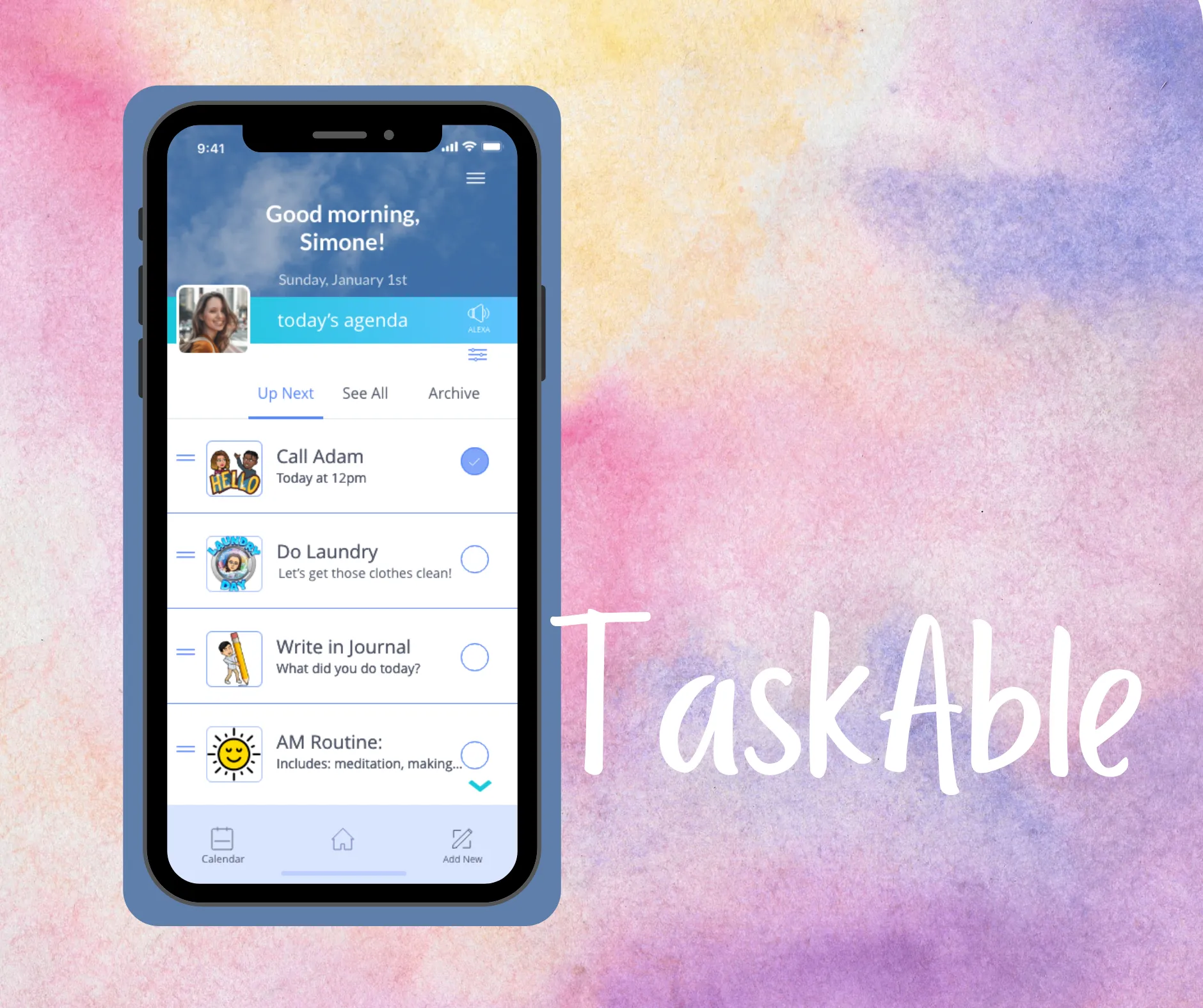
Case Study: TaskAble
Melanie Wolfertz • Dec 18, 2020

Introduction
There are hundreds of apps designed to help users navigate their busy lives. From to-do lists, to staying on task and working towards a goal, there is an app for everything. But not every app is made for neurodiverse users. In fact, out of all the top autism apps in the Google Play store and Apple App Store, none of them offer task management or productivity. And while some users with autism may be able to use standard apps, none of them cater to their specific needs and sensitivities.
The Problem
I know how important it is for people with autism to keep to a strict schedule, and how easy it is for little slip-ups to ruin someone's day. Task management shouldn't have to be stressful and time consuming, give users, parents and support systems that help the need to stay on top of their day.
The Solution
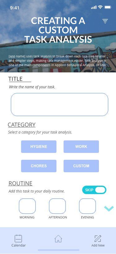
I designed an app to help users on the autism spectrum, and their caretakers and educators, stay on track and manage their day-to-day activities by incorporating key concepts from Applied Behavioral Analysis (ABA,) a type of therapy designed for people with autism spectrum disorder (ASD.)
Role
I acted as the UX lead designer, as well as UX researcher throughout the product's entire development. From early ideation to the final execution, my design process includes research, synthesis, testing, and strategic design.
Tools used:
Adobe XD, Marvel, InVision, Millanote, Miro
Research
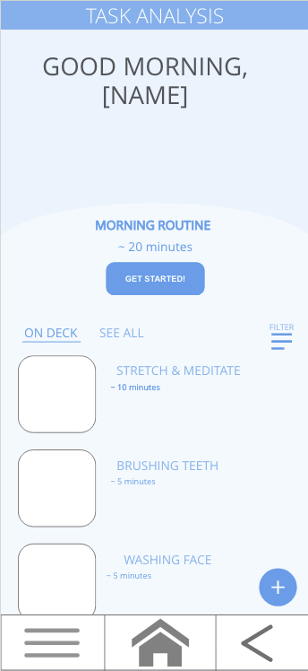
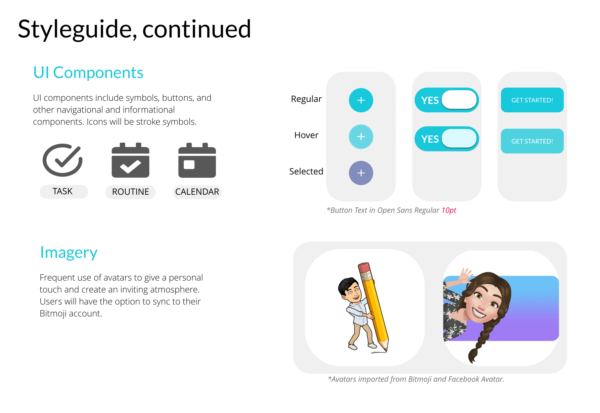
I conducted research on the existing applications for the autism community, as well as the needs and common issues of technology and autistic users. I found a wealth of resources that laid out best UI practices for neurodiverse users, which included how to appeal to sensory sensitivities such as contrast levels, animations, and other visual cues. From this research I knew I needed to include an avatar, the ability to personalize the users experience, and task analysis, a common practice used in ABA.

Methodologies
Interviews
My interview questions focused on the individuals’ relationship to autism, how they navigate productivity, and how they use technology to accomplish their goals as a caretaker/educator. I received great feedback and first-hand stories of struggles and success when dealing with technology and autism.
Affinity Mapping
Tools used: Miro
I reviewed my notes and video footage from my interviews and was able to identify seven different categories: learning behavior, technology dependence, schedules, dislikes, habits/passions, rewards, and apps used.
I noticed three strong trends:
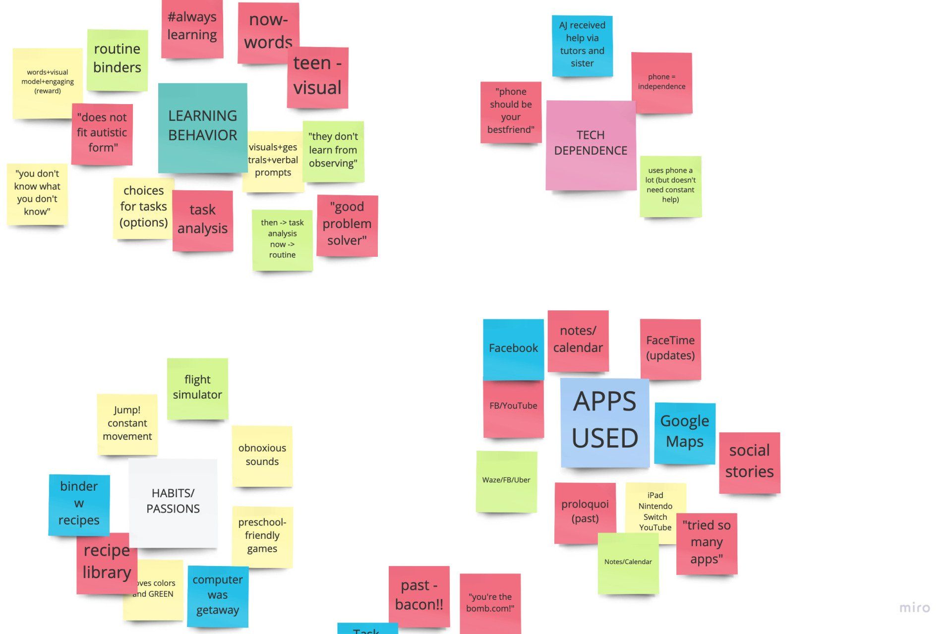
1. Keeping a schedule is key.
2. Task analysis is the most common method used in keeping a schedule and managing tasks.
3. Technology plays a vital role as an aid
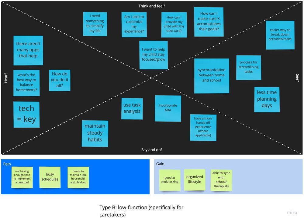
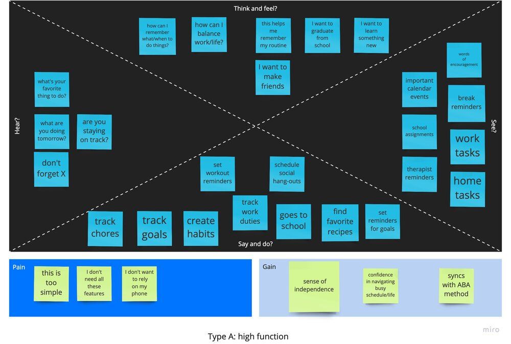
Empathy Mapping
Tools used: Miro
I created two separate empathy maps to account the different users that could benefit from my app. Type A represents high-functioning users on the autism spectrum, and would ideally use this app for themselves. Type B represents low-functioning users on the autism spectrum that would require caretakers and consistent supervision; for this type of user, the caretaker or support system would be using the app for the autistic individual.
I tried to imagine how each user would feel in their daily lives, and their pains and gains. This included how they think and feel, what they say and do, and what they hear and see. This process confirmed the diversity of the autism spectrum, and how individuals' wants and needs vary.
The Design Process
I began the design process by getting my ideas out on paper. After sketching out ideas and creating wireframes, I turned to Adobe XD where I began to digitize my wireframes. This gave me a better impression on the functionality of the app and how to best execute the core functions of the app, creating tasks and staying focused.
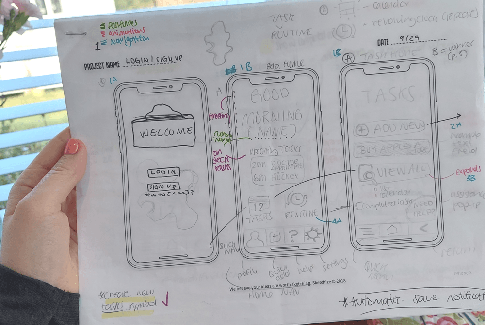
Early Wireframing
Tools used: Adobe XD
I digitized my sketches into lo-fidelity wireframes to map out my designs.
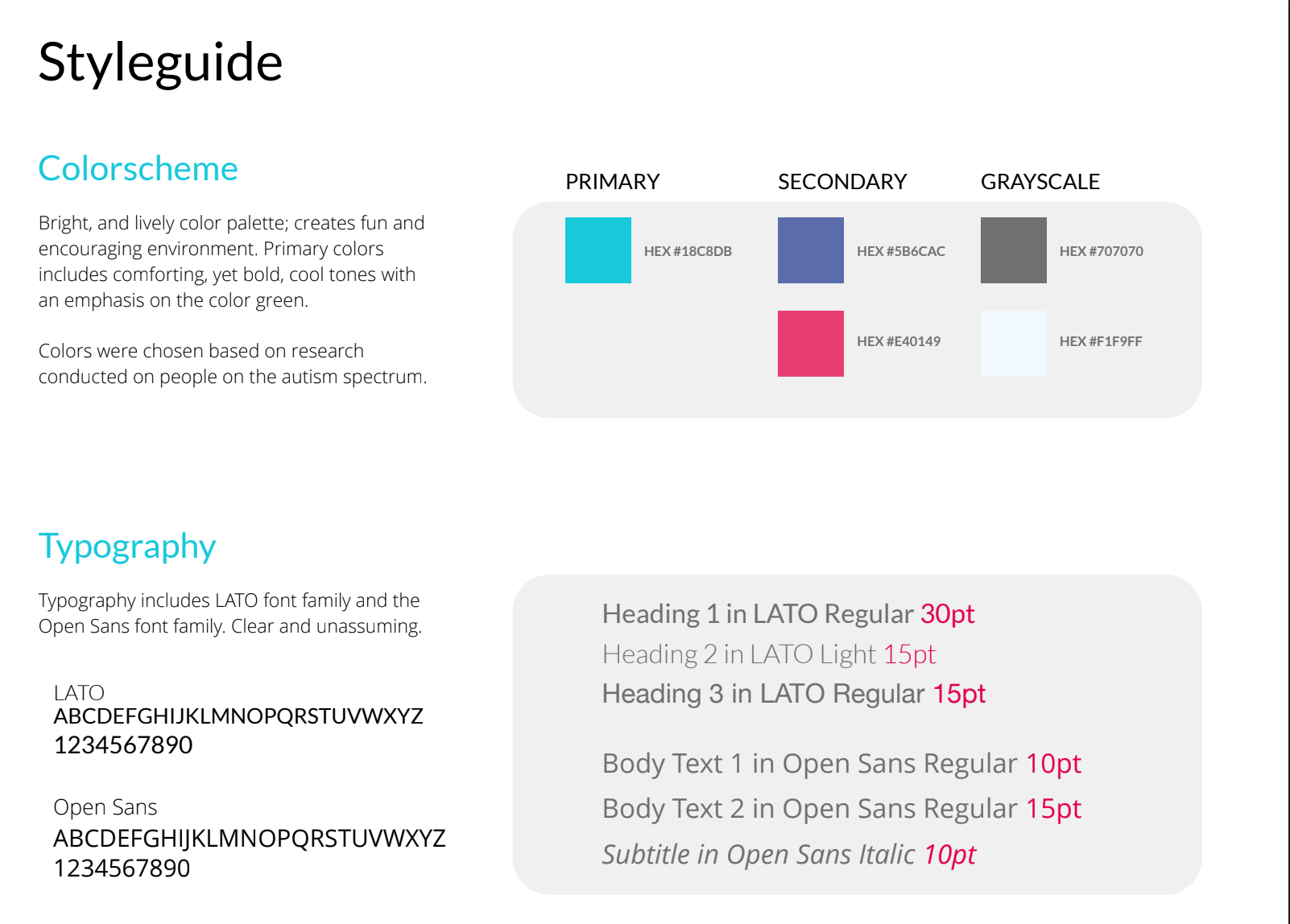
Mood Board & Style Guide
After creating lo-fidelity wireframes, I needed to compile my research and give my app some personality.
I found inspiration in apps like Headspace, which created a colorful and inviting space/interface. Avatars like Bitmoji and Facebook Avatar give a friendly and personal experience, which would be key for my audience. My mood board exudes a fun and engaging energy, with an emphasis on bold colors and clear typography. My style guide broke down my brand into specific font, icons, colors, and other UI components.

Prototyping
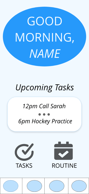
After developing my branding, I began my hi-fidelity designs. I went through several versions as I experimented with different color schemes, icons, and fonts. I realized that I would need to see my new selections in context to really find the right fit. I eventually found the right combinations and developed my final hi-fidelity design I would use for my usability testing.
Usability Testing
I conducted multiple user testing sessions where I asked each participant to complete three tasks:
- Create a new task, followed by completing the task “Call Adam.”
- Create a new routine.
- Create a new task analysis, followed by completing the task “Brush teeth.”
Takeaways from Usability Tests:
PRAISES
- "A great idea"
- Participants loved having the Bitmoji, and the concept of being able to personalize their experience.
- Participants enjoyed the "confetti" rewards when completing a task or routine.
REFLECTIONS
- Users do not have an exit route when filling out forms or interacting with pop-up notifications.
- Users need clear subtext and consistent language; this is especially important when creating for neurodiverse users.
For the final edit, I incorporated a few suggestions from my usability tests. These edits include:
- An "exit" button on the pop-up forms.
- Developing the "share progress" feature.
- Updating the language for buttons to be more direct, i.e. "Go Back" instead of "Return."
- Updating the sizes of symbols and Bitmoji placement.
- Updating the grammar and conventions for consistency.
Thoughts on TaskAble:
This was my first project working through the complete agile design process, from ideation to creation. I spent more than seven months working on this project, collecting research, sketching, iterating, testing, then reiterating, I am very proud of the work I have done. Looking back at my very full notebook, I'm able to see how much this idea transformed and flourished into the final prototype design.
From the very beginning, I pursued this project with curiosity and passion. Having been familiar with the autism community, I became very committed to the function behind this app and its potential to help users in need. This experience stands out to me for many reasons:
- Instead of working on a client's product, or developing upon an already existing product, TaskAble is the only prototype that I have created on my own (as of now.) This includes the idea for the app, and working through the design process as the lead UX designer and researcher.
- I was able to see my growth as a designer from the early research phases and familiarizing myself with different tools like Adobe XD, Marvel, and InVision. And I have come a very long way.
- I experienced the entire design process. And while yes, I am repeating myself, I cannot express how impactful this has been for my own growth as a designer. I now have a much deeper understanding and appreciation for every stage of the creating a product.
After the countless hours and edits, the most rewarding part of this experience was sharing my final prototype with people and seeing their reactions and excitement. I would love to be able to develop this idea further in the future.
Other portfolio pieces:
UX Design portfolio piece for an event-hosting business.
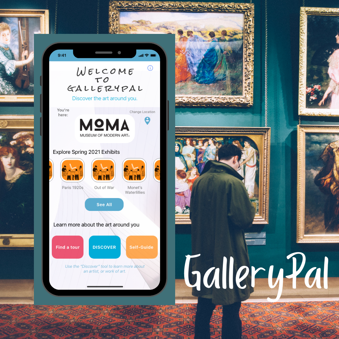
GalleryPal is an app designed to enhance how guests of museums and art galleries experience their art.