Introduction
The Problem
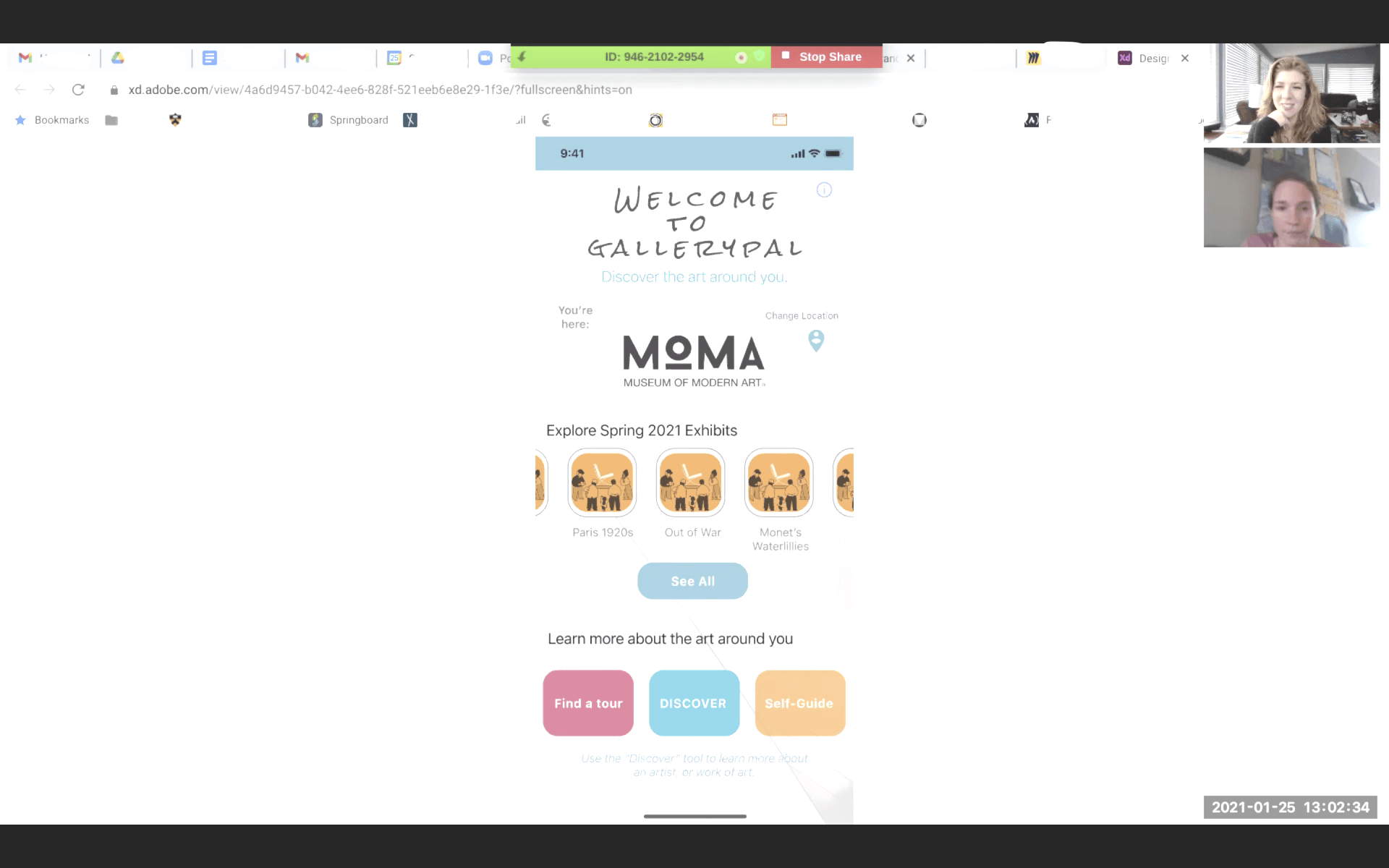
Museum guests don't know a lot about the art they are viewing unless they have prior knowledge or have done research prior to visiting.
The Solution
I designed an app to help users in museums navigate the art around them, providing quick snippets of information that makes learning on-the-go both easy, reliable, and educational.
Role
I acted as the UX lead designer; I structured my design process around Google Ventures Design Sprint model, which includes sketching, wireframing, prototyping, and user testing.
Tools used:
Adobe XD, Marvel, InVision, Millanote, Miro
Google Ventures: Design Sprint
“The sprint is a five-day process for answering critical business questions through design, prototyping, and testing ideas with customers. Developed at
GV, it’s a “greatest hits” of business strategy, innovation, behavior science, design thinking, and more—packaged into a battle-tested process that any team can use.”
-
Google Ventures
Day One: Problem & Insight
How might we?
- How might we help museum-goers and art-lovers get the most out of their visit?
- How might we educate museum guests without being overwhelming?
- How might we engage museum guests with a personalized experience?
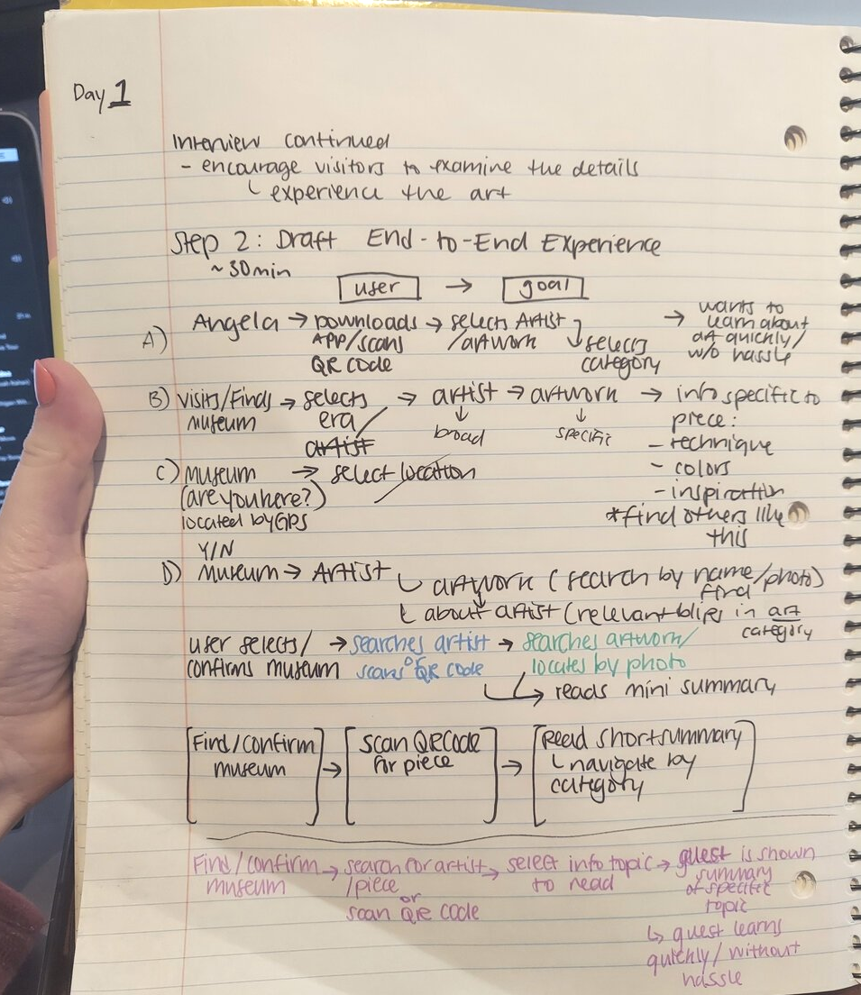
Day Two: Sketching Solutions
I conducted lightning demos and created multiple sketches from the
Crazy 8’s exercise; after creating multiple critical screens, I created my solution sketch.
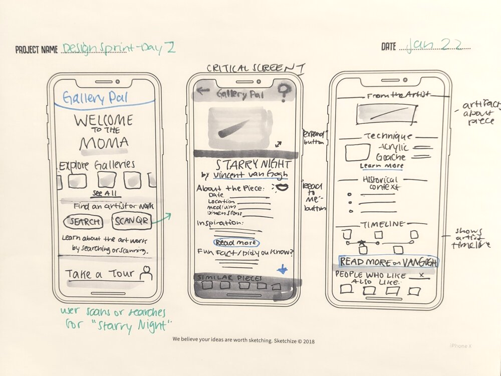
Slide title
Design sprint: Day 2, Critical Screen 1
Button
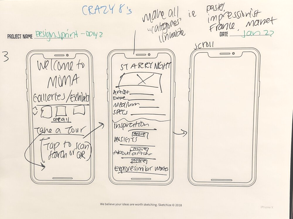
Slide title
Design sprint: Day 2, Crazy 8's Exercise
Button
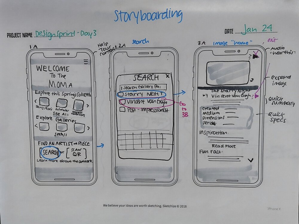
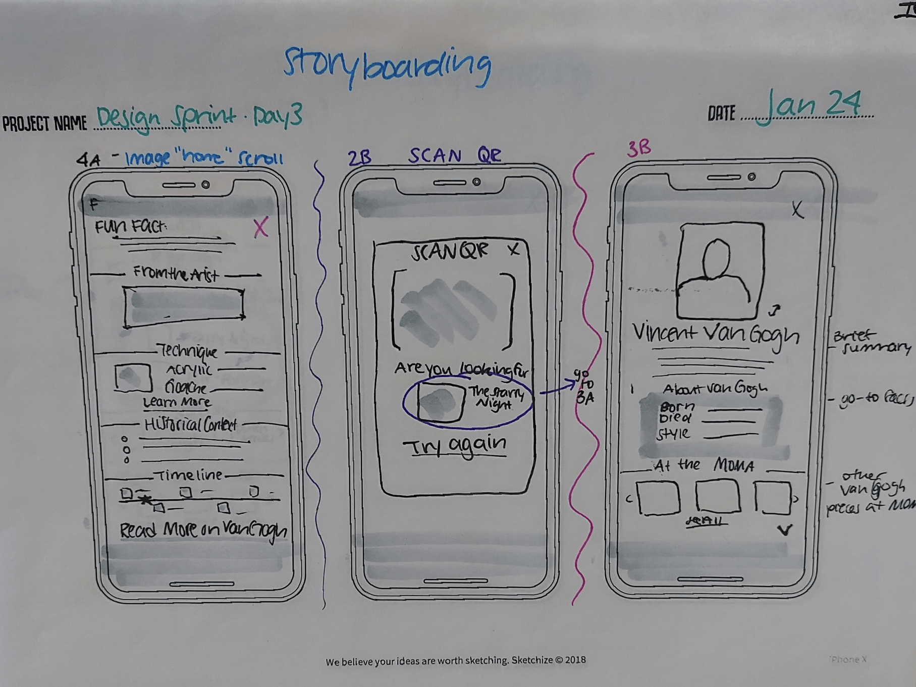
Day 3: Crazy 8’s & Storyboarding
Day 4: Prototyping your Solution
Today I set out to prototype my solution. To help me
maximize my time, I used Adobe XD plugin tools like Mimic, and Quick Mock-Up. As I design the prototype, I combine what I would want from an app like this, and what the given personas and user interviews want.
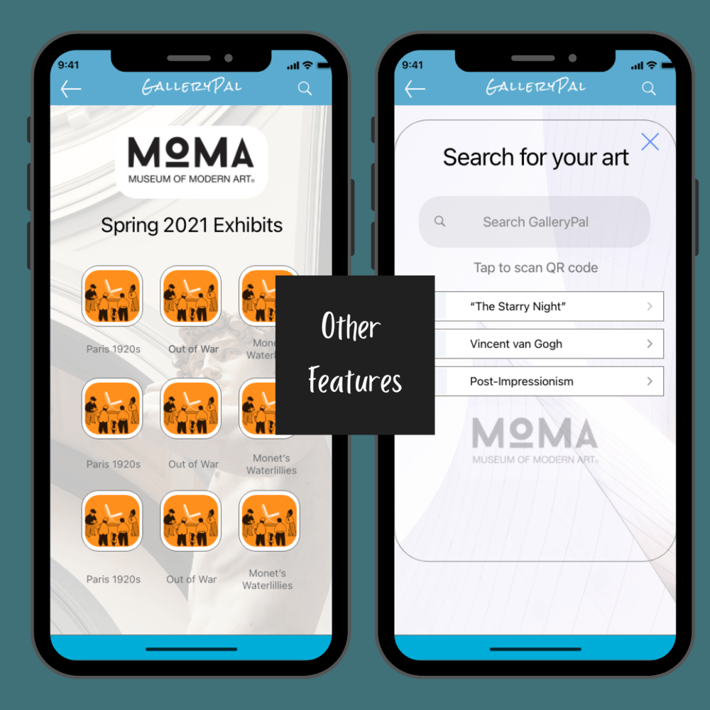
I incorporate key features like the ability to sync to the appropriate museum and to scan a QR to quickly arrive at the given work of art, giving the user
less time to worry about getting to the right page, and more about learning about the art around them.
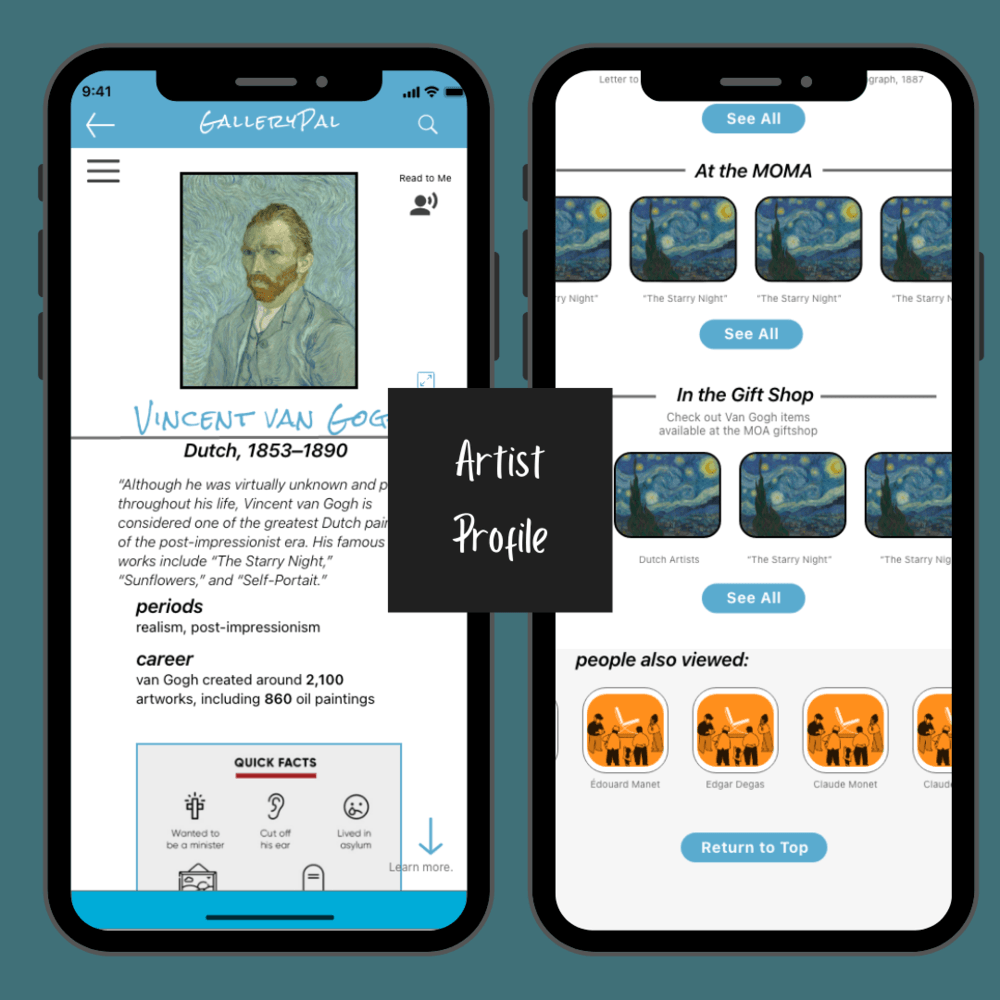
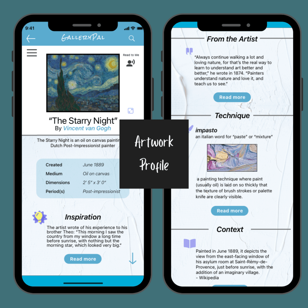
I also include other small details to
embellish the art-theme by adding backgrounds of paint texture (artist profile and artwork profile,) the Statue of David (Spring 2021 Exhibits,) and the exterior architecture of museums (home page and search page.)
Slide title
Write your caption here
Button
Slide title
Write your caption here
Button
Slide title
Write your caption here
Button
Day 5: Usability Test
Goals:
- to help the guest understand
why the art is good.
- to help the guest
learn more than they would from just walking around a museum on their own.
Takeaways from Usability Tests:
PRAISES
- “Super informative."
- GalleryPal is “helpful for people unfamiliar with art.”
- Majority of participants appreciated the integration of museum features, like the “in the gift shop,” “at the MOMA,” and the ability to explore current exhibits.
REFLECTIONS
- A “Home” icon would allow for easier navigation
- Start-up tour in beginning to show how to use app
- Adding icons to buttons to help illustrate function
For the final edit, I incorporated a few suggestions from my usability tests. These edits include:
- A “Search” symbol to the Discover button on the home page.
- A “Favorite” function when browsing Artist Profiles and artwork profiles.
- The prices for items listed in the gift shop.
- A key to the timeline in the Artwork Profile; also including relevant historical events.
- Updating the hamburger menu to a slide-out menu for the navigation in both the Artist Profile and the Artwork Profile.
- Updating the “Scan for QR Code” section in the Search page to a bold text.
On the Design Sprint Process:
As a first-timer to the GV design sprint, I found the quicker pace refreshing and invigorating. The time constraints forced myself to think out-of-the-box and more creatively; they were also helpful in keeping structure and making sure every edit I made was with
intention. This also gave me more of an
opportunity to create instinctively, as thus, more like a user operating on first impressions.
- It was odd to have user testing on such an early prototype, it made me more “protective” over my work. I found myself making sure that the participants knew this was only one day’s work, instead of a prototype that I had been working on for months, like my capstone project.
- I ended up being really
proud of the work I had accomplished in such a short time frame; this project helped to contextualize how a design sprint would be useful to companies who want to test out new features.
- The design sprint made me
appreciate how much time I had put into my capstone, and
how far I have come in my program to be able to quickly create a solution prototype in only five days.
Overall, it is a great exercise to channel creative energy and maximize your efforts.
Other portfolio pieces:
By Melanie Wolfertz
•
15 Apr, 2021
UX Design portfolio piece for an event-hosting business.
By Melanie Wolfertz
•
18 Dec, 2020
TaskAble is a task-management tool designed for users on the autism spectrum.